DNA Payments Portal Redesign Sparks Business Growth and Increased User Satisfaction
Overview
DNA Payments, a leading omnichannel payments provider in the UK and EU, needed to transform its portal to improve user experience and attract new customers. Euvic was brought on to redesign the platform, with a focus on UX, UI for the integrated mobile experience.
- Simplify the platform’s overly complicated UX and UI for greater accessibility and a frictionless payment journey
- Rework key user flows based on thoughtful user personas and journeys
- Increased new user growth by 18% and cut churn rate by more than half

DNA Payments is one of the largest independent omnichannel payment providers in the UK and EU. Since its founding in 2018, the company has focused on delivering seamless, high-quality payment experiences across various channels. DNA Payments supports over 65,000 merchants, helping them accept transactions through POS terminals, online via websites, payment links, and even over the phone. The DNA Payments Group includes a range of specialized companies: DNA Payments, 123Send, Optomany, Active Payments, EFT Solutions, Kwalitas, FPMS, Card Cutters, and Zash.


DNA Payments faced a critical challenge: its existing portal, though packed with features, was falling short of user expectations.
- The platform’s complex and confusing interface was driving users away.
- Clients could not fully leverage the platform to grow and increase their revenue.
- The disconnected systems made it difficult for the marketing and operations teams to effectively manage and optimize the platform’s potential for business growth.
It was clear that a transformation was needed to streamline the experience, engage users, and unlock new growth opportunities.


Euvic was enlisted to create a sophisticated e-commerce platform from the ground up, including designing and deploying integrated operational and marketing tools.
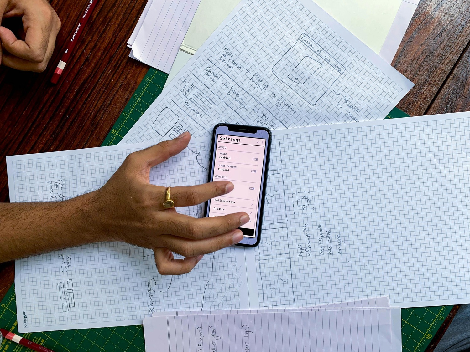
The work was organized into five steps:
- Desk research and discovery, followed by stakeholder interviews
- Audit of the current product to define crucial usability opportunities
- Create user Personas
- Create Customer Journey Maps and define key user interactions
- Prepare and prioritize the Backlog to make a large amount of work well-structured and clear
The overall project was to Redesign the platform UX and UI to deliver a seamless user experience across devices, which includes reimagining the onboarding and registration process.
Redesign the Platform
During the discovery process, we identified that users were experiencing UX friction from their first interactions at the Sign In and Sign Up tasks through to their final interactions completing required tasks. For example, the registration process took multiple days compared to competitors like Stripe that can onboard a customer in 3 minutes.
Further, the UI was inconsistent from one screen to the next, making the experience even more confusing for customers while also weakening the brand.
The platform includes the following key features:
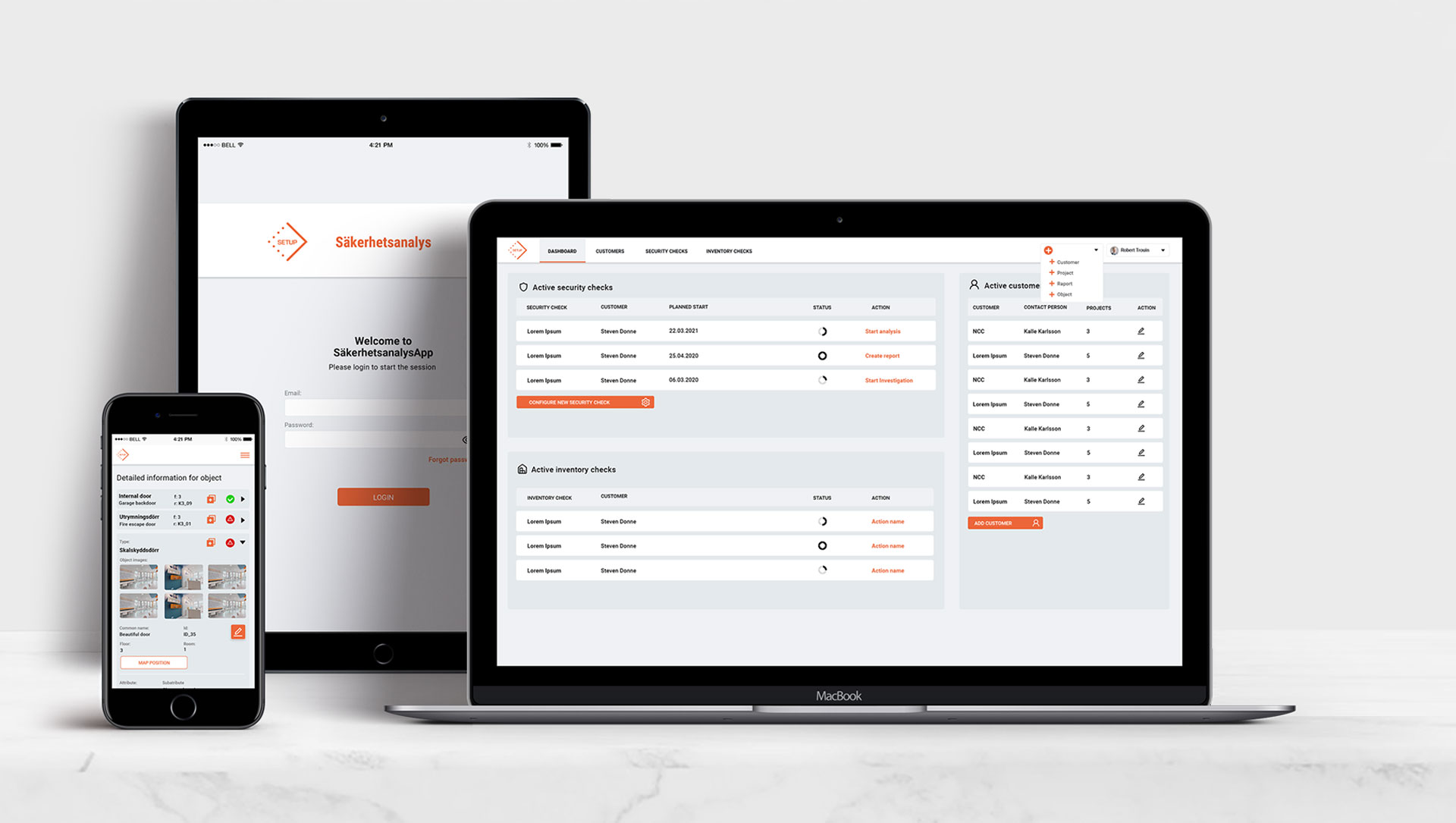
- Merchant Portal: Provides real-time updates for each processed payment. Users can monitor, track, and manage Workflow, Transactions, Refunds, and Settlements. It’s the heart and soul of the platform, enabling users to do everything from monitoring and managing payments to connecting with online chat support.
- Pay By Link: Lets users accept payments online from major credit cards, Apple Pay, Google Pay, PayPal, and others without using a website. This solution was vital for small businesses with budgetary constraints. Once activated, users log in to Merchant Portal to create and send a Payment Link to their customers.
- Virtual Terminal: Users can accept seamless, quick, and secure online payments and can easily send electronic sales receipts to customers after a successful transaction.
- Payment Methods Management: Our team integrated the best payment methods in the sector, such as Apple Pay, PayPal, and Klarna, to ensure businesses have everything in place to provide quick, secure, and easy payments.
- Business Reports: Enables users to better understanding their money turnover and business condition with Business Reports built using Chart.js. Chart.js is a free charts samples database that helped save time on graph design and make analytics easy to understand.



The team assigned to collaborate with DNA Payments was hand-chosen because of their deep experience in the fintech industry. Roles included: UX Designer, UI Designer, Project Manager, and Business Analyst.
The results of the portal redesign were both impressive and transformative. Euvic’s sleek, consistent UI enhanced the platform’s aesthetic and made navigation more intuitive, building user trust and minimizing frustration. X and UI innovations delivered high-impact improvements:
- Authorization Stepper: We simplified the registration process with a step-by-step progress tracker, allowing users to easily monitor their progress, pause and resume at will, and exchange necessary documents within the portal. This provided clear visibility and made onboarding smoother than ever before.
- Process Enhancements: By analyzing user workflows, we restructured key processes to be more logical and user-friendly. For example, introducing an option to register as a Sole Trader helped customers easily understand which services suited their registration type, making the platform more efficient and responsive.
These improvements had a dramatic effect. DNA Payments, serving over 65,000 merchants, is now on track to become the 4th largest payment provider in the UK, processing £900,000,000 monthly across 100,000 terminals and checkout pages. The redesign also delivered:
- 18% growth in new users within the first few months after launch.
- 2.3x reduction in churn rate during the first two weeks of user engagement.
The platform now offers fast, secure, and easy-to-use payment solutions, driving business growth across both online and physical locations.


.png)


